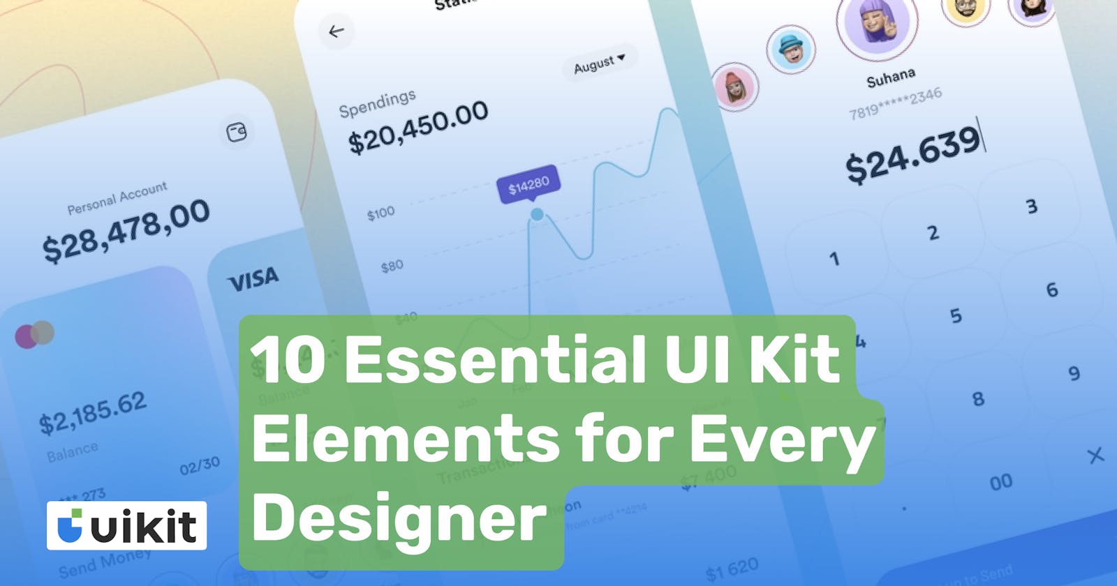
As a designer, you know how important it is to create a user-friendly interface that is easy to navigate and visually appealing. The UI kit is an essential tool for creating consistent designs that are both functional and aesthetically pleasing. In this blog, we’ll discuss the 10 essential UI kit elements that every designer should consider.
Colour Scheme: The colour scheme of your UI Kit is crucial. It sets the tone for your design and can influence the user’s emotions and behaviour. Choose colours that complement your brand and create a consistent colour scheme across your entire interface. Keep in mind that certain colours can evoke different emotions, so choose your colours carefully.
Typography: Typography is another essential element of a UI kit. Choose a font that is easy to read and matches the overall tone of your brand. Use a combination of font sizes and weights to create a hierarchy and guide the user’s eye to the most important information.
Buttons: Buttons are an essential component of any interface. They allow the user to interact with your design and perform actions. Use consistent button styles and placement throughout your design to create a seamless experience. Consider adding hover and active states to give the user visual feedback when they interact with a button.
Icons: Icons are an efficient way to communicate with your users without using words. Use a consistent set of icons throughout your interface to create a recognizable visual language. Consider the context in which the icon will be used and choose icons that are easy to understand.
Forms: Forms are a critical component of many interfaces. They allow users to provide information and interact with your design. Use consistent form styles and placement throughout your interface. Consider using a responsive design to accommodate different screen sizes.
Navigation: Navigation is an essential element of any interface. It allows users to move through your design and find the information they need. Use a consistent navigation structure and placement throughout your design. Consider using breadcrumbs or a sitemap to help users find their way around.
Cards: Cards are a popular design element for displaying content. They provide a visual hierarchy and make it easy for users to scan through information. Use a consistent card design and placement throughout your interface. Consider using hover and active states to give the user visual feedback when they interact with a card.
Alerts: Alerts are a way to communicate important information to the user. Use a consistent alert style and placement throughout your design. Consider the context in which the alert will be used and choose an appropriate style and placement.
Modals: Modals are a way to present information to the user in a separate window. Use a consistent modal style and placement throughout your design. Consider using models for actions that require confirmation or for displaying additional information.
Animations: Animations can be an effective way to communicate with your users and make your design more engaging. Use consistent animation styles and placement throughout your design. Consider using animations for actions that require feedback or for drawing the user’s attention to important information.
In conclusion, a UI kit is an essential tool for creating consistent designs that are both functional and aesthetically pleasing. The 10 essential UI kit elements we discussed – colour scheme, typography, buttons, icons, forms, navigation, cards, alerts, modals, and animations – will help you create a seamless user experience. By using a consistent design language, you’ll create an interface that is easy to navigate and visually appealing, making your users happy and engaged.

